The nonprofit is rolling out a new design system, accompanied by a guide to why it matters and how to use it.
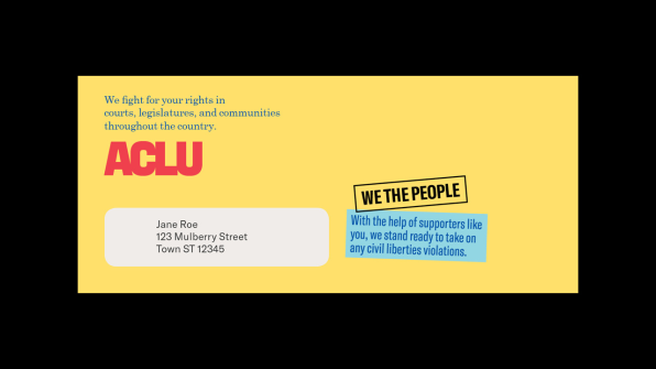
![The system is like a kit of parts and offers the ACLU and its affiliates flexibility in how it’s implemented. [Image: courtesy Open]](https://assets.fastcompany.com/image/upload/w_707)
Now, it has a new visual identity–and design handbook–to match. The identity, which began quietly rolling out across the organization this week, was created by the New York-based design studio Open. It was a year in the making, with work beginning well before the 2016 election, and it includes a new word mark by typographer Tobias Frere-Jones, a vibrant new color palette (“red, everything, and blue,” as the designers put it), and new U.S. history-inspired graphic treatments, like the font used in Supreme Court briefs and engraving-style visuals.
“The new identity makes the ACLU look like what it has already become,” Scott Stowell, principal of Open, says. “[The ACLU] is here for everyone and is helping all of us. We want what it looks like to express that.”
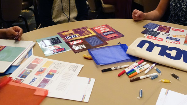
It’s all in support of its new public-facing communication and strategy developed by the consulting firm Co:Collective. Three years ago, the ACLU began a “brand refresh” and shifted its persona from a closed, authoritative organization of experts to one that’s inclusive and conversational with its allies and supporters. It’s no accident that the nonprofit has been ubiquitous on the front lines of protests this year, communicating directly with people on Twitter, and rallying more people to join in its efforts to defend the freedoms of every American: It’s all part of a strategy to become relevant again and find new ways to advance its mission.Open’s design work, which includes a guide for ACLU employees, is a visual allegory for that evolution. As the ACLU becomes more conversational, its identity is becoming more flexible. It’s a pivotal tool as the organization mobilizes to accommodate new modes of communication, new strategies, and new conversations.
A DESIGN MANIFESTO INSPIRED BY THE CONSTITUTION
It was only 15 years ago, in 2002, that the ACLU adopted an official visual identity, riffing on the familiar Statue of Liberty. Open’s redesign is its first update since then.
While the ACLU has over 1,000 employees and 53 affiliates, it only employs three graphic designers nationwide. The visual system had to be easy enough for non-professional designers to use, so a key part of Open’s identity was compiling it–and detailed instructions on why it matters and how to use it–into a document called The ACLU Design Handbook. “At this time in history (and this time in the ACLU’s history), it’s more important then ever to reach out to as many people as possible in as many ways as possible,” the book explains. “We must always talk to those who disagree with us, those who have never heard of us, and those who continue to stand with us.”
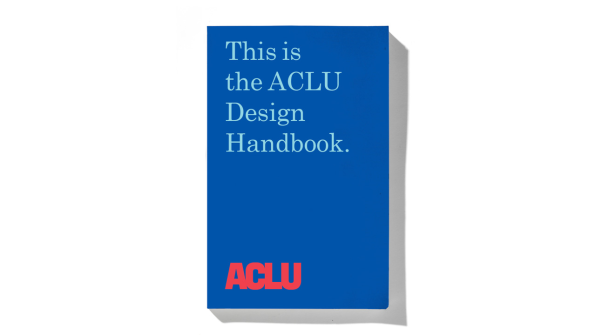
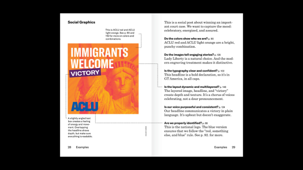
The 178-page handbook was modeled after the organization’s Pocket Constitution. It’s not a rule book filled with precise measurements on how large a logo should be in proportion to where it appears or grids specifying how much room should be around text or images. Instead, it offers simple, direct guidance for creating design collateral that adheres to the overall sensibility of the ACLU: being bold, accessible, dynamic, clear, and surprising.For the book, Open created examples of ACLU graphics under the categories of “posts that inform people,” “celebratory/positive posts,” “serious posts,” and “posts that activate people.” There are mock-ups of what text overlay on video could look like, too. “We say, ‘Here’s a bunch of tools, here’s what the tools mean, here’s how you might use the tools to make stuff, here’s what that stuff may be, now go for it,’” Stowell says.
It’s a didactic but not prescriptive approach–almost like a crash course in how to be a graphic designer. “Standards manuals are either some 20-pound thing sold on Kickstarter or a PDF no one looks at,” Stowell adds. “This is written for a human to read.”
DON’T CALL IT A BRAND
Tobias Frere-Jones drew the ACLU’s new word mark, which riffs on a logo discovered in the ACLU’s archives. (No records existed on the archival logo’s designer or when it officially entered the ACLU’s visual lexicon, but it was most heavily used from 1984 to 2001 .) The word mark can be rendered in red or blue, speaking to the ACLU’s nonpartisanship, and its letters bleed into each other, representing unity and solidarity.

The decision to move away from using the Statue of Liberty as a catch-all symbol representing the ACLU was deliberate. It’s an image that’s most closely associated with immigration, and the organization’s work extends far beyond that realm. The handbook does recommend using the statue elsewhere as part of the image vocabulary for ACLU collateral, just not as the logo. “The way we look at it, we didn’t take her away, we just freed her from the box,” Stowell says.
The identity’s new color palette includes 14 different colors. The handbook recommends “Red, something else, and blue,” for graphics, symbolizing the principles that guide all of the ACLU’s work: diversity and inclusion. “We are not just red, white, and blue,” the handbook states elsewhere. “We are red, everything, and blue.”
Even the typeface the ACLU chose for collateral has its roots in American history–it’s Century, “the same typeface required by law for all Supreme Court briefs,” the handbook explains. Meanwhile, to unify the range of photographs that the ACLU will inevitably use across its graphics, Open specified overlays of diagonal lines inspired by the texture of engravings, like the portrait of George Washington on the $1 bill.
Throughout our conversation about the new identity, Stowell was careful not to call the design system one specific thing: branding. And while many of the devices in the Design Handbook are indebted to the world of corporate branding, Stowell sees the ACLU’s system in an different light.
“To me, branding feels like something imposed from the outside; identity is how the choices you make are a manifestation of who you are,” he says. With the Design Handbook, the ACLU has a more powerful vocabulary to articulate what it stands for. Considering the realities of our political climate and how our civil liberties are increasingly under siege, it couldn’t have come at a better time.
–
