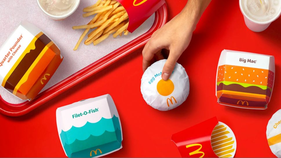
Hot off the heels of Burger King’s bold, illustration-led rebrand last month, McDonald’s has unveiled a redesign of its own – and it’s very, well, bold and illustration-led. Favouring bright graphics and prominent typography, the new look sees its entire packaging receive a playful makeover that’s fun, celebratory and retro – just like its rival’s.
Designed to bring “a sense of joy and ease” to the brand, the redesign features delightfully simple vector-style illustrations depicting its most iconic products and ingredients. (Check out our best Illustrator tutorials if you’re inspired to create your own packaging design.)
“We pulled out the most delicious and iconic aspects of each menu item to redesign their entire packaging system from top to bottom,” says Pearlfisher, the agency behind the new look. “Bringing personality to life through simple illustration allows for the packaging to be functionally unique, easy to identify, aesthetically minimal and, most importantly, emotionally joyful.”
While it might be yet another exercise in flat design, McDonald’s new packaging design manages to stand out from the (very large) crowd. The basic, geometric shapes (below) and relatively simple yet bold colour scheme manage to juggle a functional purpose (each product is easily recognisable) with that all-important sense of fun. There’s also a pleasing retro quality to the new aesthetic as a whole, emphasised by the clean, sans-serif typeface.
But how does it fare in the burger wars? Given the proximity of their unveilings, it’s hard not to compare McDonald’s’ effort with Burger King’s excellent rebrand – and the similarities haven’t gone unnoticed on Twitter (below). With its juicy new logo and typeface, we’d say the King gets to keep the crown this time.
Then again, perhaps it’s a little unfair to compare – McDonald’s’ is a rather less comprehensive rebrand, with no changes to its main logo (an iconic design arguably up there with the best logos ever).
While some corners of the internet are clearly suffering from flat design fatigue, we’re still seeing new examples of ingenious minimal graphic design. McDonald’s’ new look might not be quite as sizzling as Burger King’s, but both prove there’s still plenty of room for playfulness in the world of flat design.
Read more:
- 7 graphic design trends to cheer you up in 2021
- Iconic car logos reimagined as baby animals are the cutest thing you’ll see all day
- This black PS5 throws some serious shade at Sony
Guest Author: Daniel Piper
This article first appeared in www.creativebloq.com Seeking to build and grow your brand using the force of consumer insight, strategic foresight, creative disruption and technology prowess? Talk to us at +971 50 6254340 or engage@groupisd.com or visit www.groupisd.com/story

