Cozy up to a blog called McMansion Hell, for starters.
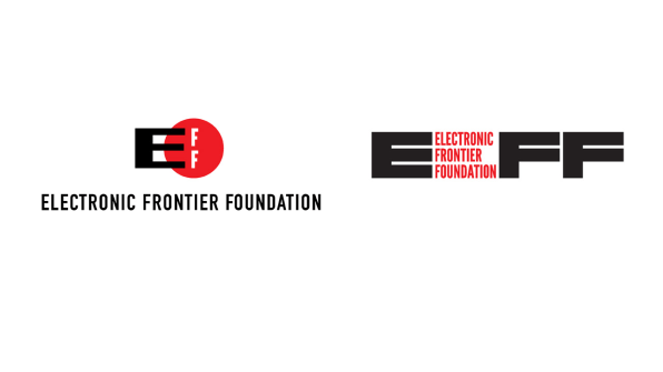
Despite its cutting-edge mission, EFF had a logo that looked like it was from the earliest days of the internet. It was also impractical: It was a round logo that contained only the organization’s acronym, with the E jutting out the left side, making the whole thing hard to read. This week, EFF unveiled a new logo designed pro bono by Pentagram partner (and Hillary Clinton campaign logo designer) Michael Bierut and his team.

Called “Insider,” the entire logo is modular, with each letter of EFF taking up the same amount of space–meaning it can stack vertically or horizontally or transform into an L shape. Pentagram designer Katie Rominger, who worked on the project as well, designed it so that the organization’s full, very lengthy name could sit inside of the acronym.
The strength and boldness of the logo is meant to denote the seriousness of the organization’s work, despite how immaterial the internet and digital rights can feel sometimes. “We wanted to convey that there was a rigor and solidity to the kind of thinking that they were bringing to these problems, which would stand up just as much as any other kind of law,” Bierut says.
Bierut’s decision to design the logo for free stemmed from a Tumblr called McMansion Hell, of all things. Run by blogger and writer Kate Wagner, McMansion Hell is a shrewd–and hilarious–analysis of some of the grossest architectural structures on the planet (and Bierut is a fan of the blog). Wagner had used images taken from the website of online real estate company Zillow, and one day in 2017 the company sent her a letter demanding she take down the photos–which threatened her livelihood. Bierut, who heard what happened on Twitter, reached out to Wagner and offered to help find her legal help, when she told him that EFF was going to take on the case. EFF wrote Zillow a letter, arguing for fair use of the images, and Zillow dropped its complaint. “There’s nothing more satisfying than a beautifully argued legal letter,” Bierut says.
While following the controversy, Bierut began spending more time on EFF’s website. “Every time I went there I was struck by how–in my opinion–goofy-looking their logo was,” he says. “It looks like something out of early ’90s video game culture, at best. It was just weird-looking.”
Bierut, pained by the logo and grateful to EFF for helping Wagner, reached out to the organization’s creative director Hugh D’Andrade, offering to redesign the logo for free–something he’d never actively offered before, though he has done many pro bono projects. “There’s something presumptuous and insane about it. Even after I sent the email, I thought, it’s just creepy,” Bierut says. “For some people it might be like going up to someone and saying, your kid is funny-looking, have you considered plastic surgery? It’s just not a polite thing to say.”
D’Andrade was thrilled. He had been ready for a new logo for many years, felt he was too close to the organization to design it himself, and had been hoping a designer would come along who was willing to do it pro bono. He says he was so surprised to see Bierut’s email, he initially thought it was spam. After convincing EFF’s executive director Cindy Cohn and the rest of the staff that it was a great offer, D’Andrade accepted and began to work with Pentagram.
This week, EFF unveiled the logo. Bierut reached out to Wagner to tell her of her involvement, and she told him she’s already bought a shirt. Its simple color matches the previous logo, and its strength and distinctiveness echoes the rising urgency of digital rights in our current era.
“We needed something that matched the boldness of our vision, something strong and forthright,” D’Andrade says. “We aren’t fooling around when we demand digital rights for everyone on the planet. We needed a logo that matched that vision.”
–
This article first appeared in www.fastcompany.com
Guest Author: Katharine Schwab is an associate editor based in New York who covers technology, design, and culture.

![[Photo: courtesy Pentagram]](https://images.fastcompany.net/image/upload/w_562)