First of all, try to be human.

We’ve all been frustrated when talking to a computer. Maybe it can’t understand what you’re saying. Maybe it hears you, but doesn’t understand what you mean. Or maybe it’s just a tedious chat with a cloying personality with whom you’d never choose to associate in real life.
Such are the problems of designing voice interfaces. In theory, voice is the ultimate medium–one people don’t have to learn to use. “Users are instant experts. There’s nothing to teach, or at least there shouldn’t be,” says Daniel Padgett, conversational design lead at Google. “It’s something that they’ve been doing forever. Because of that, they have high expectations.”
However, the fact that human speech is so nuanced and contextually driven makes a serious challenge for any designer or company looking to break into this new medium. And voice interfaces aren’t just for companies like Google, Microsoft, Amazon, and Apple anymore. Now that more and more businesses actually build their own chatbots for shopping and customer support, it’s a skill more companies need to learn.
At Google’s big I/O conference last week, conversational experts from across the company gave half a dozen different talks about the best practices of designing dialogs between people and computers. We listened in–and compiled the best bits into three overarching tips.
LEARN FROM GREAT CONVERSATIONALISTS
To designers who are delving into building conversing bots for the first time, Padgett offers a useful metaphor beyond two people talking. “If you can imagine, it’s like the critical elements of your mobile app disappearing as soon as they appeared,” says Padgett, “[with] the back button, the hamburger menu, kind of fading away. Content appearing once and only for a fleeting moment.”

Why is this important? Because designers tend to think in visual solutions for UX. But they’re wildly different. In a conversation, a user doesn’t always know their “outs,” or options, simply because they cannot be seen. There’s no menu, no back button, no graphical user interface at all.Instead, as a designer, your only fallbacks are the social norms with which we all speak (like saying hello or goodbye), the prompts you give a user through spoken language (like asking their name or another piece of information), and what a user might remember from recent conversations with the bot itself.
If that sounds complicated, perhaps another metaphor is in order. Having spent 20 years at Pixar, Oren Jacob, founder of chat tech company Pullstring, argues that the entire industry is focused too much on using artificial intelligence to make it possible to anticipate what a human being might potentially ask at any moment–and not enough on carefully written conversation, filled with characters built from dialogs, that unfolds just like a Hollywood script.
“You can think about this space as interactive screenwriting,” says Jacob. “We’re responsible for lines one, three, five, and seven, but not two, four, six, and eight.” The even numbered lines, of course, belong to the users.
One secret to making sure that line one leads to two, and two leads to three, comes from James Giongola, creative lead on conversation design and voice direction at Google. He recommends that chat designers take advantage of the rules baked into the Cooperative Principle, a concept created by British philosopher Paul Grice in the 1970s. Grice theorized that people employ all sorts of norms (which are known as Grice’s Maxims) to make sure that conversations flow normally. These maxims serve as simple hacks for anyone writing robo-conversations–the key is to make sure your bot is always offering enough information to keep a conversation going.
What does that mean in practice? Well, if you asked someone if they were going to a friend’s party tonight, they probably wouldn’t just say “no” and leave it at that. They’d say “no, but are you?” or “no, I have another date.” They would offer a hook to keep the flow of conversation going.
HIDE “ERRORS” THE SAME WAY PEOPLE DO
If you’re in a loud bar, and you miss what your companion says, sometimes it’s worth stopping the conversation and asking them to repeat themselves. But sometimes–let’s be honest–their observation or factoid seems less crucial than just keeping the pace and fun of the conversation going. So you keep talking, even though you missed bit.
“If you don’t need information . . . move on, pivot, or gracefully end [the conversation],” advises Nandini Stocker, conversation design lead at Google.

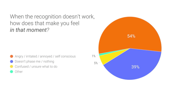
To be clear, Google will almost always re-ask a question it misses in its apps, using a tool called “rapid reprompts.” A reprompt is the same question being asked again with different phrasing–and it can be as simple as “what did you say?”“But . . . you can imagine if you don’t catch something the first time, and the second time, that becomes pretty tiresome pretty quickly,” says Stocker. And in these instances? She says it’s worth asking yourself, as a designer or developer, if you need that information anyway, or if you can make certain assumptions to operate around it. If someone is booking a table at a restaurant, and you miss the number of people in their party, can you at least continue the conversation by assuming it will be less than 20.
However, it’s not always the case that errors should be swept under the rug. It is sometimes worth taking the extra line of dialog to clarify if the information is crucial. “I’ll hear a lot of people say, ‘oh, it’s an extra step,’” says Padgett. “But believe me, taking that extra step is way better than the correction [someone’s] going to have to do if you get it wrong.”
DON’T FEAR STRONG PERSONALITIES
In real life, it can be hard to connect to someone who doesn’t seem to have any opinion or world view, no passions or strong preferences. The same goes for chatbots.
“If I built a [bot] that appealed to absolutely everybody, it would be the most boring thing in the world,” says Jacob. But what’s the alternative? “Do we [recreate] Darth Vader? . . . That is the challenge of the space.”
Deciding just who your character is will come down to your identity as a brand, Jacob said. But it’s worth thinking deeply about how your brand’s personality acts. In fact, Brad Abrams, group product manager for the Google Assistant Platform, revealed that Google has discovered that the conversational bots with the best retention also had the strongest personas.

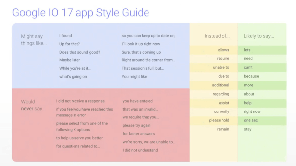
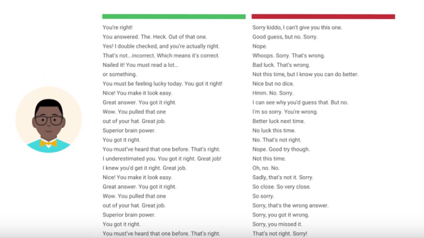
To build their own bot for the Google I/O app, Abrams and the team created a “persona sheet,” which is a tool that serves as a shorthand reference to how a bot talks. It specifies different phrasing decisions that their bot might make, like saying “more” rather than “additional,” along with all sorts of other more casual phrases. As the team splits up to actually write line after line of dialog, they could reference their persona sheet for ease of use.In another example–a trivia app–Stocker took the persona idea even further, building out a teacher named Mr. Montgomery complete with a little avatar. “He would be the type of character who is super encouraging, [saying] ‘you got this!’ He’s a teacher!,” says Stocker. So Mr. Montgomery has 50 different randomized ways of saying “you’re right,” and 30 encouraging ways to say “you’re wrong.”
But bots don’t always need to be merely supportive. Stocker argues that there are many instances where errors–like a Google Home not hearing its user–could be obfuscated by a bot with a stronger personality. One example she gave? A reservation app asks the time you’d like to have dinner. If the bot doesn’t understand the response, it can go into a more proactive mode, saying, “I can put you down for 6:30–does that work?” saving several steps of back and forth.
So just like humans, your bot should be quick on its feet–even if it doesn’t understand exactly what’s going on.
–
