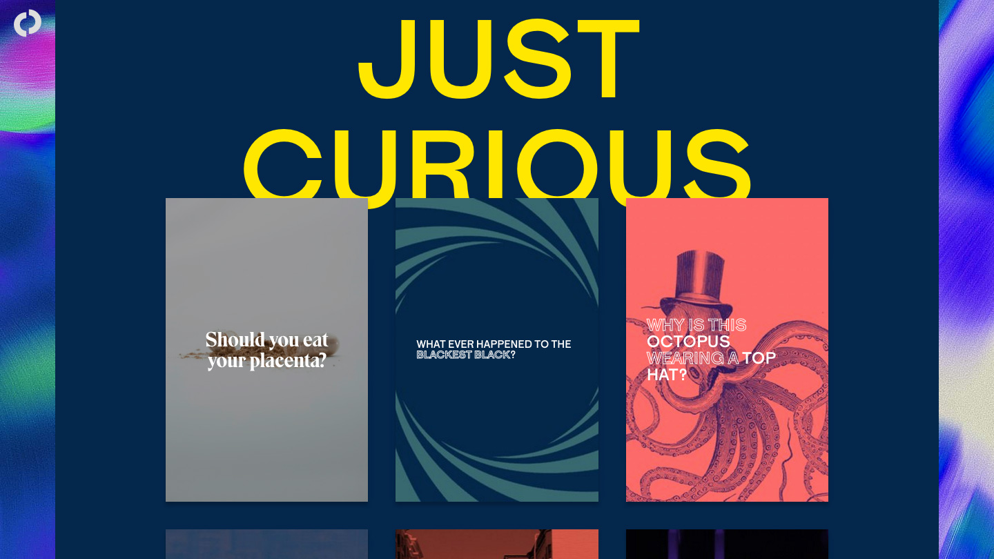
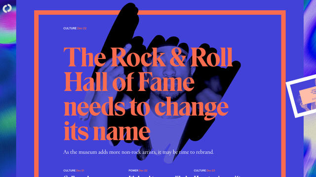
The design team behind the new site, Code and Theory, explained what makes its aesthetic so different.
Is The Outline the ugliest website on the web right now? Possibly, but that may not be a bad thing.
The news website, spearheaded by The Verge’s co-founder Josh Topolsky and launched in December, aims to be a digital-first destination for content. The text-heavy site looks like a hybrid of a print magazine and a Geocities blog. It’s an eyeful—a carefully-designed eyeful—with a gritty, net-inspired aesthetic meant to show readers that it’s different from everything else out there. A flying saucer icon rests on the corner of every article. There’s a squiggly, animated line below every headline. Highlighted content is surrounded by graphic clipart, drop-shadows galore. Each page assaults the eyes with dozens of colors and fonts. It’s a purely digital visual language, derived from decades of internet culture.
The Outline is a new media experiment, and it looks like no other news site around. It’s strategically designed to use this eye-popping web aesthetic to bolster attention and loyalty. Will it translate that into a thriving media business? I tried to find out.

Back in August, Topolsky told Poynter that the site is meant for a limited audience; he wanted to create content that will be interesting and engaging and not just crank out endless posts in the hope that it will attract eyeballs. “How do you be interesting?” he asked. “How do you make them curious, how do you engage them?”
Topolsky hired the digital creative firm Code and Theory to create the site. They’ve worked together for years—Code and Theory designed The Verge and Engadget, and most recently redesigned Bloomberg Businessweek (all three of which Topolsky worked at). According to Code and Theory’s co-founder, Dan Gardner, the two have obsessively riffed for years about what the future of media will look like. The core question Gardner and Topolsky were battling with? “How am I going to resonate and identify this as The Outline not just a random piece of content?”
The Outline’s answer seems to lie in its design, which it’s betting on to bring back loyal readers and differentiate it from its competitors. I asked Gardner what, design-wise, The Outline is doing that’s different from other websites. “Media, companies—even digital media companies like Huffington Post or Vox Media… or BuzzFeed—[have] learned to do what they do very well,” he says, which is “[grabbing] traffic through individual stories.” What’s been lost, he says, is “differentiation between that storytelling.”
That begins with the content itself, but also how it’s conveyed through the design. Gardner goes on, “You could almost do a test right now; pull up with any random website and the components of that story are the same. The format is almost exactly the same.” Digital audiences expect the same thing from websites, whether they’re the New York Times, BuzzFeed, or Breitbart. Instead, the duo wanted to tell stories in a multitude of ways on The Outline. “You may see a story in 15 to 20 words,” he says. “You may see a story in one word.” What he wants is a way for the team to think about “the best way to articulate” a story. The Outline has text stories, shorter visual stories, and some audio projects too (one of the first things it produced was a podcast about the HBO show “Westworld”). Gardner says The Outline wants to employ endless forms of unique storytelling in the future, including video.

Some of the site’s design elements strike me as random, perhaps functioning as tricks to catch readers’ eyes. Why is there a squiggly line below headlines? What’s the point of a huge red box of headlines? Does a barrage of fonts really enhance an experience? The idea, says Gardner, is to cultivate a sense for what the site is, and how it differs from others. “It’s about how can we create a bit more fun on what has typically become quite mundane UI design,” wrote Gardner in a follow-up email. “It also helps to create a consistent tone between the content.”
There’s an irreverent voice in the design, one that matches much of the content. “We tried to take the best of what’s familiar from current social platforms and marry it with historical references that we found interesting, even including print magazines like The Face, and other artwork that came out of the ‘90s as computer graphics started to evolve and visual experimentation was high because there were less ‘best standards’ to rely on,” he writes, citing art and architecture of the ‘50s and mid-century typography as well.
“The overall strategy for the strange elements’ purpose is really to create excitement, intrigue by unexpectedness,” Gardner writes. The interface contains countless nods to the internet of yore—Microsoft’s Clippy, space aliens, weird text borders. It could easily double as an X-Files AngelFire fan site from 1997. “In a time where you could barely see the distinction from one site to another anymore,” he continues, “it was important for us to give a distinct look and feel.”
For now, the site’s design rests on the thesis that if people enjoy looking at an interesting or even beautiful article, they may engage with it differently than they would with another news story or site.
It’s a big bet—one that has yet to be proven out. Today, digital media is under a microscope. Everything and nothing is being labeled as “fake news,” and regurgitated content seems to be oozing from the ears of every media company on Earth. So perhaps there’s some credence to the idea that a digital-first news organization can make a splash by letting audiences know that it is most definitely not anything like the rest because it looks nothing like the rest—even as it evolves in the future. “The one constant will be change,” Gardner says. Now we just have to wait and see what change The Outline will bring.

