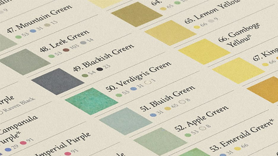
Centuries after naturalists used it to define the colors they saw in the natural world, Werner’s Nomenclature of Colours is back.
The nomenclature of colors we use today is really a machine language–numerical hex codes crafted to communicate with software on computers and printers. Before the age of CMYK and RBG, though, artists and scientists created their own languages for talking about and categorizing color. Though many have fallen into obscurity, at least one is now accessible to anyone with access to the internet: Werner’s Nomenclature of Colours.
Published in 1814 by the painter Patrick Syme based on the work of geologist Abraham Gottlob Werner, Werner’s is a working dictionary of colors found in the natural world, complete with swatches and examples of animals, minerals, and vegetables where a particular hue could be found in the wild. The book was a work straight out of the early days of natural science–Darwin traveled with a copy, and used its definitions in his writings. Compared to the precise, computerized way color is defined today, Werner’s is less than practical, yet there’s something lovely about its definitions. You could find #2, or Reddish White, on the egg of a gray linnet, for instance, or the back of Christmas rose or in porcelain soil. Auricula Purple, #41, describes the eggs of a blue bottle fly. Look for #71, Straw Yellow, on the fur of a polar bear.
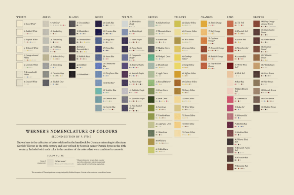
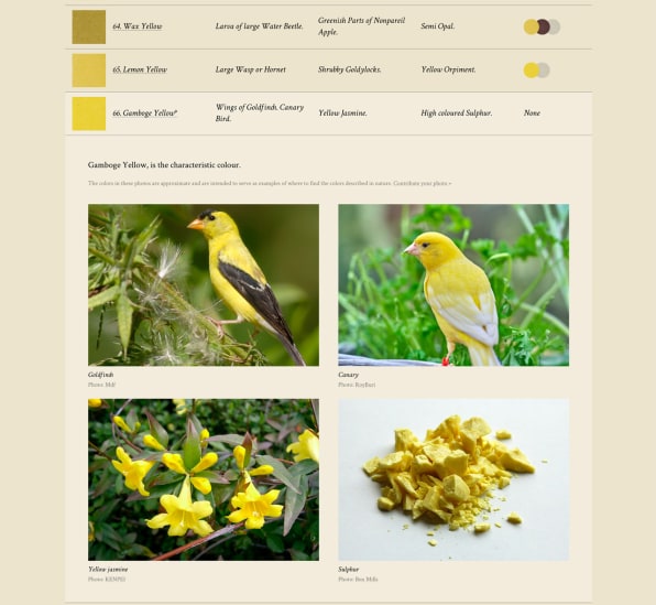
Earlier this year, the Smithsonian rekindled public interest in Werner’safter it reissued the 200-year-old book–and now, the tome has a digital facsimile thanks to the designer Nicholas Rougeux, who recently launched an interactive version with additions like data visualizations of its 110 colors and internet-sourced photographs of the animals and minerals that the book references. “I think someone had mentioned the Smithsonian reissue and it struck a chord with me,” he explains via email. “I enjoy breathing life into older works and exploring them in different ways.”
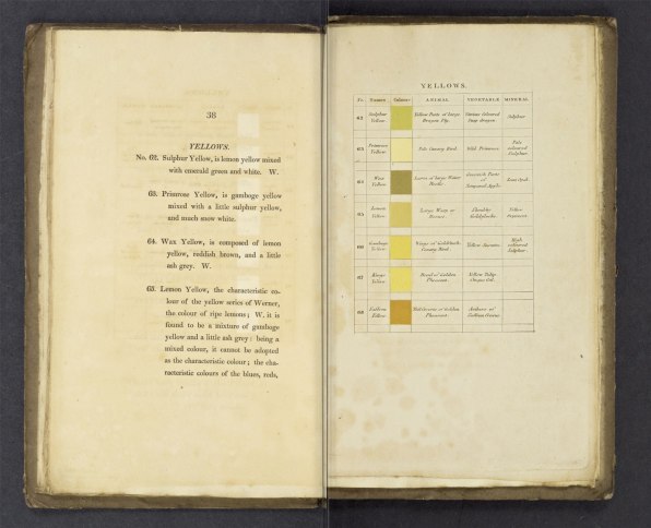
Thanks to the Internet Archive’s free scans of the book, Rougeux was able to extract its data and rethink its presentation for contemporary times. “I was pleased to find that it’s what I consider a perfect bite-size data set: a small publication with a little bit of data that can be explored in fun easy ways without manipulating thousands or millions of records,” he writes. The finished product reframes 18th-century color nomenclature with contemporary data visualization and web design–it’s calming to breeze through its contents, but also a usable tool for designers and artists.
And on a public Google Doc, Rougeux compiled Syme’s colors and added a few 21st-century definitions of his own: The hex codes for each of the 18th-century hues, from Skimmed Milk White (#e6e1c9) to Veinous Blood Red (#3f3033).
–
This article first appeared in www.fastcompany.com
Guest Author: Kelsey Campbell-Dollaghan is Co.Design’s deputy editor.
