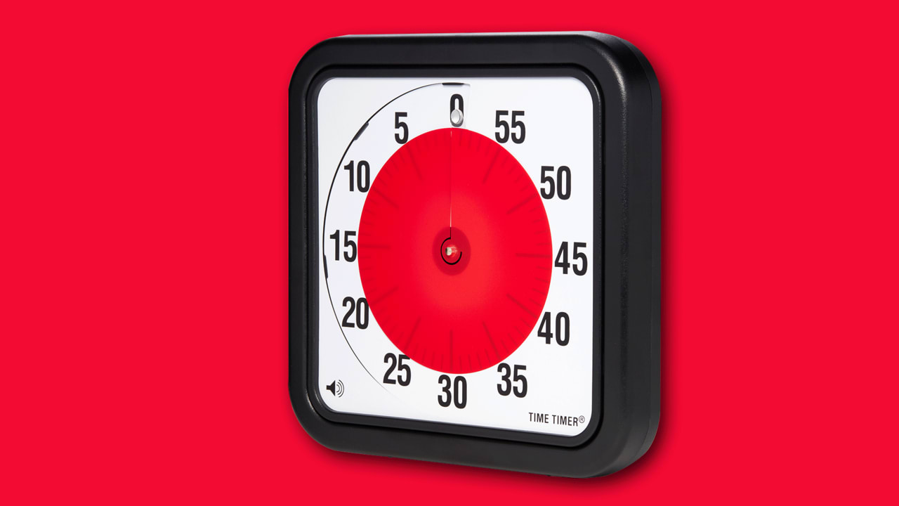
About five years ago, I started looking for a new timer to use in my design workshops for business executives.
I’d used a watch up until then and communicated time to participants like, “we’ll stop at 2:35,” or “five minutes starting now . . . one minute . . . okay we’re almost done, so wrap up your current concepts . . . okay, let’s wrap up . . . okay, let’s quiet down and share.” Repeatedly asking enthusiastic CEOs to put down their Sharpies just wasn’t cutting it. I wanted everyone to be on the same page about how much time remained on a given exercise–something with a definitive end and something that would spatiallydisplay time to concretely communicate an otherwise squishy concept.
Then I came across the device that would quickly become my most valued design tool: the Time Timer. It was love at first sight. In a life surrounded by feature-packed, overly designed gizmos begging for my attention every moment of every day, the Time Timer was the most earnestly designed object I’d ever seen. It’s one of those objects that is so simple, it’s easy to think that it wasn’t even designed at all, that it just exists because that’s what it was meant to be. It’s even called the Time Timer! It didn’t have some cute monosyllabic meaningless name. It is exactly what it is, a time timer, and it is perfect.
I use an 8-inch timer for my workshops, I have a little one in my kitchen, and I have a 12-inch timer on the wall right next to my monitor in my office. It keeps me on track. Why do these work so well? It all comes down to its physicality.
EXTERNALIZED UNDERSTANDING
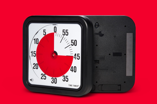
One of the most important aspects of the design process is externalizing abstract thoughts or ideas. We sketch things out, we put them in experience maps and service blueprints, and we build prototypes to make these abstract things concrete. When the abstract is made physical, we can think through the details of how they work, but we also are able to share that understanding with the other people in the room. Everyone is considering the same information, and there’s less room for interpretation. The Time Timer works in the exact same way; it’s physical and external, everyone is getting the exact same information at the same time.
DATA TO INFORMATION
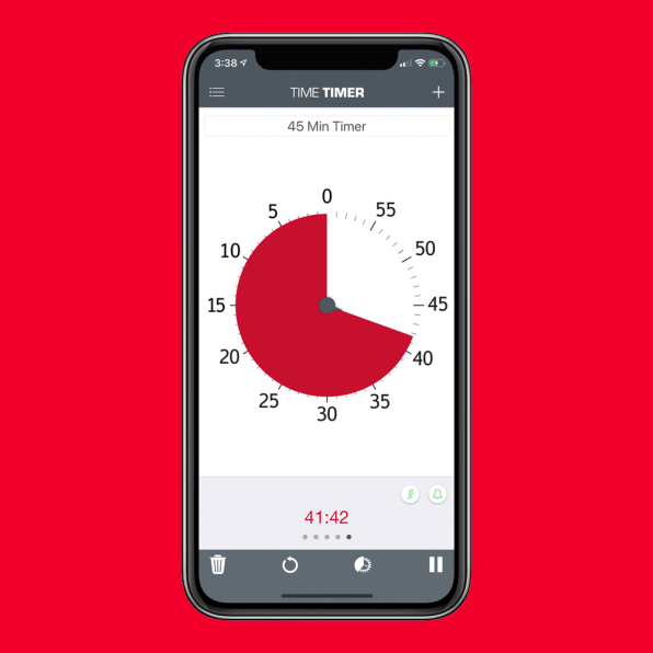
In addition to the shared consensus of the timer being external, the spatial representation of time makes shared understanding clearer and more immediate. Generally when you look at a clock, you do some calculations. The clock will tell you what time it is, and then you compare that time to a predefined event. For example, you’ve got a meeting at 10:15. You look at the clock and it’s 9:38–you then subtract 9:38 from 10:15 and you find that you have 37 minutes until your meeting. When time is displayed spatially, there’s no math. You glance over at the timer, and you immediately understand how much time is left; it’s faster, and there’s less cognitive load.
SOFT AWARENESS
One of the biggest advantages of a spatial display of time is that it allows you have a peripheral awareness of the time. When you’re working on things that require higher-order thought, such as writing code, or thinking through a complex design process, you’re holding a lot of things in your head. Looking at the clock and doing base-60 subtraction will immediately snap you out of this thought process. I think of the large timer next to my desk as a “big red blob” that I can keep an eye on without having to divert my attention from the task at hand.
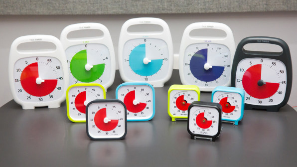
Time Timer is catching on in human-centered design circles. It was featured in Jake Knapp’s book Sprint, and subsequently included in Google Ventures’ Sprint Kit. More recently it showed up in Jake Knapp and John Zeratsky’s great new book Make Time
. For the book, they actually partnered with Time Timer to make a special 120-minute Make Time Edition Time Timer, which is the designer equivalent of getting a shoe deal with Nike. I recommend checking out the new book, and strategically placing time timers in every room of your studio.
–
This article first appeared in www.fastcompany.com
Guest Author: Scott Sullivan is an Experience Designer at Adaptive Path in San Francisco and co-author of O’Reilly’s Designing for Emerging Technologies.
