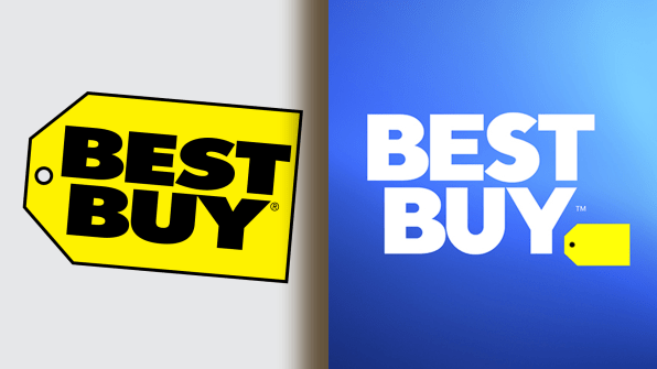
Best Buy has used its iconic yellow tag logo for nearly 30 years, but that logo’s reign has come to an end. It’s being replaced with a more generic, taller wordmark that no longer needs to crouch its letters down to fit on a label. Meanwhile, the tag lives on, but it’s been reduced in prominence to the size of a period.
The “why” isn’t so hard to ascertain here. Some VP surely realized that brick and mortar stores are changing. They are no longer about inventory, but about services. In this case, Best Buy’s service is the expertise of its Blue Shirt employees. And with that shift, the whole visual metaphor of the price tag is only getting more tone deaf by the day (even if dusty old Best Buy is growing healthily, most recently beating its own expectations thanks to the Superbowl).

Reducing the tag also helps Best Buy look conversational–literally. Its new ad campaign will be all about conversations between Best Buy employees and customers. In print, these chats are playing out with text-message-like word bubbles. And Best Buy, without the tag, can blend into these bubbles as part of the discussion. Visually, the Best Buy brand becomes synonymous with the conversation itself.
All-in-all, it seems like a conservative update that was smart enough to keep around some of its brand equity. That is, until you realize one other detail.

–
