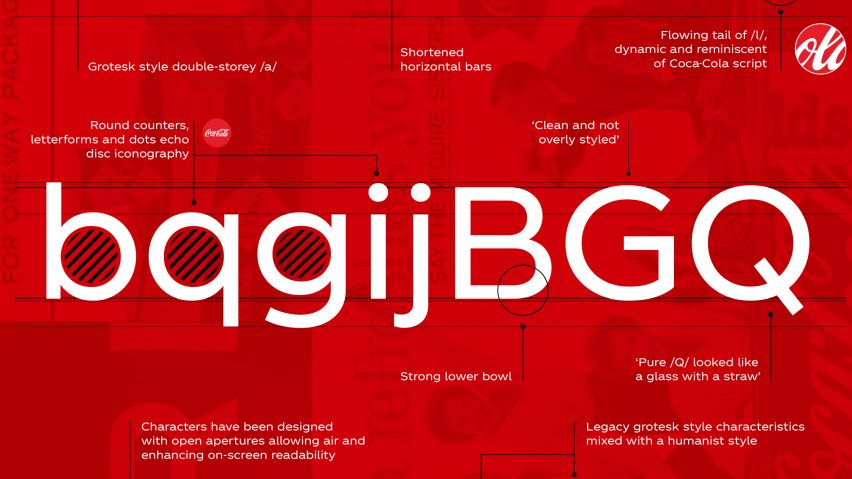

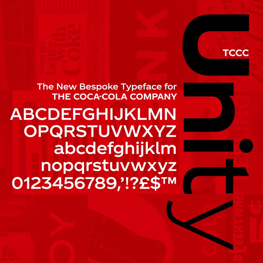
Coca-Cola has revealed its new typeface designed by British graphic designer Neville Brody, marking the first time that the brand has had its own unique font in its 130-year history.
Named TCCC Unity – an acronym of The Coca-Cola Company – the typeface was unveiled last week at the Museum of Design Atlanta by Coca-Cola’s vice president of global design, James Sommerville, who told the audience that the typeface “encapsulates elements from Coca-Cola’s past and its American Modernist heritage.”
The font, designed by Neville Brody’s eponymous typographic design agency Brody Associates, is the first own-brand typeface in the soda company’s 130-year history.
Brody, known for his pioneering work in the late 80s and 90s as the designer behind influential magazine The Face, was asked to create a flexible typeface for Coca-Cola that would work across all scales and platforms.
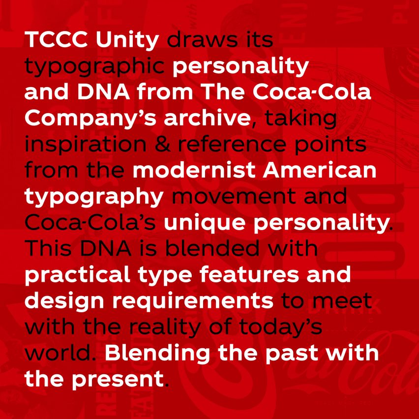
Using the brand’s extensive archive for inspiration, Brody worked with alongside the in-house team at Coca-Cola to develop a typeface that retained a level of familiarity.
While Coca-Cola described the resulting TCCC Unity as a future-facing font, others were quick to point out that a new typeface will not be enough to rectify declining soda sales.
In an article for Fast Company magazine, writer Mark Wilson called the typeface a “modern font for stone-aged thinking”, stating that “Coca-Cola continues to operate under the mindset that its sinking soda ship is a brand problem rather than a product problem.”
He added: “…it’s time that Coca-Cola rethinks its core convictions, and what it can do with a global distribution network other than sell more soda.
Commenting on Twitter, @FdK_Simon agreed: “Design can do a lot of things, but only if focused where it matters – not sure that investing in a new typeface is going to halt the decline of Coca-Cola. However, the post-rationale of relating it to the brand heritage is a triumph of marketing nonsense!”.
Fellow Twitter user @arthuradesign weighed in with: “Design can help change a business problem but a product problem is not fixed with a typeface.”
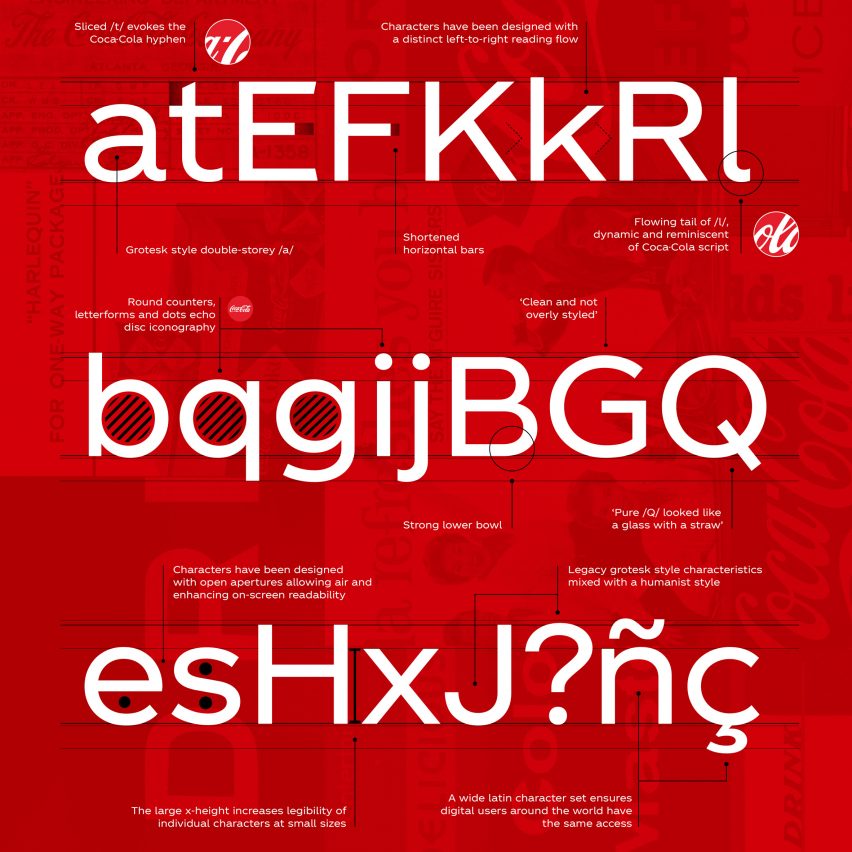
Following TCCC Unity’s launch, Sommerville posted a presentation to his instagram account, in which the wide form font, with its open arcs and rounded counters, is showcased in a number of weights and styles.
“Geometric flair and circularity drawn from the archive form the basis of the Latin script,” it read. “A large x-height ensures it works in physical and digital environments.”
“Regular weights are used for text and headlines,” it continued, “with Condensed weights applied to information text.”
The introduction of the bespoke font sees Coca-Cola following in the footsteps of brands such as YouTube, the BBC, IBM, Nokia, Intel and Airbnb – all of which have launched their own typefaces.
To mark the launch, Coca-Cola has also introduced a smartphone app that can be used by those with an interest in design and typography to discover more about the ethos behind TCCC Unity’s design.
The app features interviews with the typeface’s creators in which they explain the design process and also detail TCCC Unity’s various styles, weights and specimens.
In recent years Neville Brody has created the new visual identity for UK broadcaster Channel 4 and the typeface for England 2014 football kit. He also reworked the Royal College of Art’s house font by Margaret Calvert as part of the London institution’s rebrand in 2012.
Since becoming a dean of the Royal College of Art’s School of Communications, he has spoken out against government plans to remove creative subjects from the UK curriculum, and also suggested that the design industry in the UK should step in to plug the education funding gap.
–
