The Pentagram Papers have been published since the ’70s and are the firm’s only promotional material.
If you’re one of the lucky few, you’ll open your mailbox about once a year to find a slim black volume with the words “Pentagram Papers” in block lettering at the top.
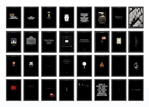
These little black books are the closest that the prestigious graphic design firm Pentagram gets to sending out a business brochure. Started in the late 1970s by Pentagram partner John McConnell, the papers don’t actually showcase work that the firm has done. Instead, McConnell’s idea was to highlight sets of unusual visual artifacts that the firm’s partners found compelling and share them with the world as a way of distinguishing the firm and its tastes. The books arrive randomly in the mailboxes of clients, friends, and colleagues who’ve made the mailing list, and they come in a limited run, giving them an air of exclusivity–which, of course, helps bolster the firm’s brand.“The justification as business self-promotion is really just disguising a really self-indulgent form of vanity publishing,” says Michael Bierut, one of the firm’s partners. “People would get it and think, Pentagram, aren’t they clever, they know so many interesting people.”
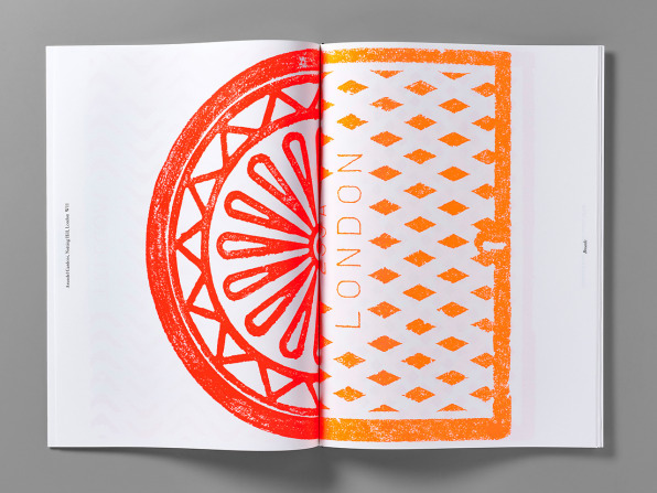
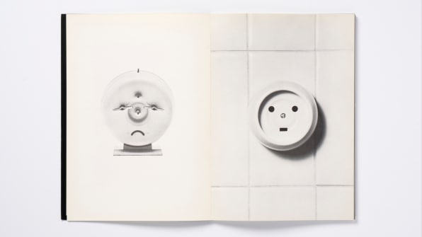
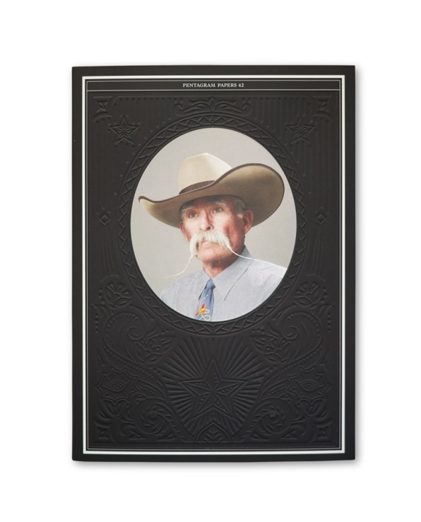
For Bierut, the series is a chance for the firm to highlight something random and intriguing. Number 21 is focused on crop circles in the U.K., with graphic symbols representing the patterns of the strange phenomena. Number 45, the only oversized Pentagram Paper, displays fluorescent rubbings of London’s manhole covers. The most recent, number 47, documents numbered museum coat check tags and locker keys.There’s also a precious element to them–Bierut had received a few before joining Pentagram in 1990, and he remembers treasuring them, particularly the fourth edition, entitled “Face to Face,” which included a series of photographs of objects that look like they have faces by the Swiss brothers Jean and Francois Robert.
The little black books are published typically once a year or so. (Bierut says that because the firm is entirely run by designers, there’s no one demanding the Pentagram Papers come out with any regularity.) Every spring and fall, Pentagram’s partners meet to discuss various elements of their work, and ideas for the Pentagram Papers are always an agenda item. “Someone will come and say, my grandmother has this amazing collection of signed concert programs when she was a page turner at the Teatro in Buenos Aires,” Bierut says. “The only time I’ve seen ideas rejected is when they’re not esoteric enough. A bunch of nice pictures won’t make it. Specificity and something that rewards curiosity tend to be the things that are favored. ”
Bierut himself has raised the ideas for several. The first one he did was number 30, photographs his wife had taken of the surprising amount of garish, neon architecture in the town of Wildwood, New Jersey, on the Jersey Shore. Another was a 2013 essay originally published in the New York Times by the filmmaker Errol Morris that makes the scientific argument that Baskerville is the most trustworthy typeface. The kicker? The Pentagram Paper version of the essay is what Bierut called “an over-designed testimony to the authority of Baskerville as a typographer and a typeface,” since it was designed in the style of John Baskerville’s 1762 version of the Book of Common Prayer.
If you want 1 of the 5,000 or so copies printed annually, you won’t be able to find them in stores. But Bierut insists that it’s easy enough to get on the mailing list, which is composed of clients, colleagues, and friends–you just have to “make your interest known” to him or to another partner.
“Getting off the list is probably harder,” he says. “You have to move and leave no forwarding address.”
Check out some blockbuster Pentagram Papers in the slide show above.
–